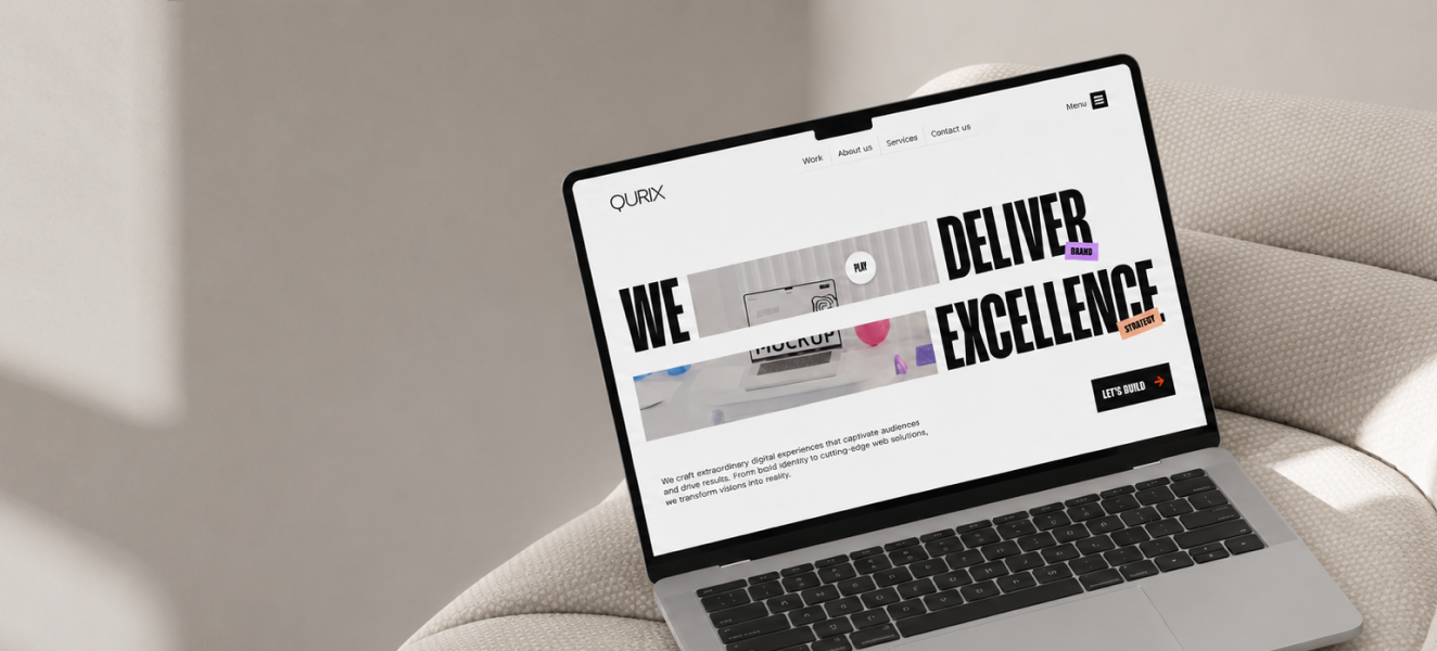
Klyvo
A dark brand studio landing page with strong positioning, premium mood, and direct conversion cues.
Overview
Klyvo is presented as a polished landing page case study with attention to visual hierarchy, conversion, and real product clarity.
Product Goal
The goal was to make the experience feel premium and easy to understand while keeping the core brand conversion workflow visible from the first screen.
UX Direction
The layout prioritizes fast scanning, clear entry points, useful content grouping, and reduced decision friction across the most important product moments.
Visual System
The interface uses restrained typography, strong spacing, considered contrast, and image-led presentation to make the product feel modern and trustworthy.
Outcome
The final direction gives the product a stronger market presence and a cleaner foundation for landing pages, dashboards, mobile flows, or launch assets.
Have a project in mind?
I'm available for focused UI/UX projects, product redesigns, and design systems. Let's build something that stands out.
More case studies
Somiqora
A dark mindfulness landing page for affirmations, audio sessions, and personal growth positioning.